Illustration and Visual Narrative / Project 1
03.04.23 - 05.05.23 / Week 1 - Week 6
Name: ALYSSA AISYAH BINTI 'ARIEF NASRAN (0364017)
BDCM
BDCM
Project 1: Exercises - Vormator Character + Illustrated Typography
LECTURES
Week 1 - Briefing + Onboarding + Introduction to Vormator
Briefing
For the first week of class Mr Hafiz gave us a briefing on the module
content of the subject to prepare us of what is to be expected along with an
introduction to the assignments we will need to complete throughout the
semester.
Shortly after, he introduced us to Adobe Illustrator, which is a graphic
design application widely used by graphic designers to create vector
graphics made up of node points, lines, shapes, and curves based on
mathematical formulas rather than a set amount of pixels like raster
graphics, and therefore vector art can be scaled up or down while
maintaining image quality, we went through the functionalities and tools of
Illustrator, such as the toolbar, workspace, and how to create work using it
as we would be using the application for our assignments.
The main tool used to create these vector graphics in Illustrator is the Pen Tool, and to familiarize ourselves with it, Mr Hafiz made us play a web game called the "Bézier game", as it is a fun way to train graphic designers in learning about the Bézier curve. Through this game I gained a better understanding on the way the Bézier curve works, and how create more efficient solutions for my outlines using less control points.

Fig 1.0 Bezier Curves

Fig 1.1 Bezier Game Score
Onboarding:
Introduction to Vormator
After learning about Illustrator and the Bézier curve, we were given instructions for the first part of Exercise 1: Vormator Character Challenge, which was to outline the 8 shapes given with the Pen Tool using the knowledge we learned from the Bézier game in class.
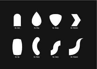
Fig 1.2 Vormator Shapes
Week 2 - Character Design + Creating Shapes
Character Design
Stylized Design: Stylized design refers to taking the original concept, and breaking away
from it by giving it an abstract look and its own unique sense of design to
it - it is what makes a character look visually appealing and recognizable
to the audience, a notable example is the iconic character of Mickey Mouse,
where just by seeing the outline of his head by itself, is still
identifiable with his character. The three principles of Stylized Design
are: iconic (easily recognizable), simplicity (understand
characters easily), and unique (memorable, leaving an impact).

Fig 1.3 Mickey Mouse Logo
Shapes: Shapes design the silhouette of a character, and is used to identify one
character from another. It is often that the shape of a character provides
the baseline of their role in a story, as we tend to see more unbalanced
use of shapes in villains as the design is meant to invoke a sense of
uneasiness in the viewer, and vice versa for the good protagonists, the
use of shapes in their design are more well-balanced. Therefore we can use
a characters persona as the basis of the shapes for their design; adding
or subtracting "weight" to their personality, like using a shape that is
more rectangular, compact, and large for a character who has a strong
personality. Some good examples of distinct use in shapes for character
design can be seen in Monsters Inc, such as Sulli- a rectangular shape,
Mike- a round shape, and Randall- a triangular shape.

Fig 1.4 Monsters Inc Shape Silhouettes
Colours: Colours are used to establish the basic roles of the character, and play
an important part in determining and separating the basic
characteristics of the heroes, villains, and background characters.
Different colours also give impressions of different emotions, and so
choosing colour correctly is important as you want to convey the right
emotion or message to the viewer. It is often that to separate a good
character from a bad one in a story, opposing/contrasting colours are
used. A good example for the use of colours is in Star Wars, where the
villains (The Sith) are designed with darker colours, and colours that
generally have an association with more bad and evil, Black and Red. On
the other hand, the good guys (The Jedi) are designed with lighter
colours, and colours that generally have an association with more good
and virtue, White and Blue. The Sith vs The Jedi have contrasting
colours to each other, and it uses these colours as a representation for
what these characters are like in relation to what the colours generally
are associated with and represent.

Fig 1.5 Star Wars Poster
Emphasis + Contrast: Emphasis and contrast though being two different design principals
usually come in pairs in good character designs. Emphasis refers to what
is exaggerated in a character, while contrast refers to the use of
opposites or different elements within a character, a good character
design exaggerates on the emphasis and contrasting visual elements to
make the design stand out using colours, and a good use of both can make
a character memorable for the viewer. An example of successful use
of emphasis and contrast in character design is Anger from Inside Out.
His design elements place emphasis in his large expressive eyes and
mouth to exaggerate his emotions, emphasis and exaggeration is also seen
in his fire-y hair to match with his temper, while the contrasting
element in his design is in the lower half of his body, being short and
stocky,- compared to the upper half of his body where most of his
expressiveness lies due to the use of larger shapes and emphasized
elements, along with his big temper, his eyes, mouth, and emotions are
big, yet his body is compact. These opposing elements give his design
contrast.

Fig 1.6 Anger Inside Out
Harmony: Harmony is about every element in a design complimenting each other,
this includes things such as shapes, lines, colours, motifs, patterns-
all of them combined must be put together in a tasteful manner to have a
very pleasing factor to the viewer. One way to achieve harmony is to
think of visual hierarchy- starting with the "accent" a character has or
a certain visual element the viewer will be attracted to look at first
before doing an exploration on the rest of the character design. Harmony
is important in character designs as it can play a role in how it
reflects with the narrative of the characters, an example of this is
from Inside Out's Riley and her emotions, vs Riley's parents and their
emotions. Riley being a kid has more emotive and individualistic
designed emotions as she is still growing and trying to find herself,
while Riley's parents emotions appear to have taken the look of their
dominant emotion and their real-world appearance as well, in Riley's dad
this is anger as the rest of his emotions dress up in the same attire
even sporting the mustache, while in Riley's mom, her dominant emotion
is sadness- and like Riley's dad, the rest of her emotions appear
similar to each other in attire and even demeanor, wearing the same pair
of red glasses and purple sweater, referring to the fact that as you
grow older you will tend to have a more dominant emotion that you rely
on. This contrast between Riley and her parents create the backbone of
the story in exploration of the different emotions occurring in Riley's
head in comparison with her parents. The designs for the emotions for
each character in the story uniquely fit the individual character we are
looking at creating harmony in their designs and visual narratives.

Fig 1.7 Riley's Emotions Inside Out

Fig 1.8 Riley's Parents Emotions Inside Out
Expressions + Poses: Expressions and Poses go hand in hand, just like emphasis and contrast.
Expressions and poses are the clear visualization of characters in
behaviour, quirks, and personalities. This can be seen in facial
expressions, body language, and even certain design elements. An
expressive, emotive character makes it easier to appeal to the viewer as
it makes the motif clear on what you are trying to convey. An
example of this is Disgust from Inside out, as her name suggests, her
default look and state is that of disgust as her facial expression and
pose indicates that, she also possesses long eyelashes to exaggerate the
emotion she represents and display a more vain-like quality, she also
wears a purple scarf showing vanity. Certain expressions and poses not
only emphasize on the story narrative, but also can accentuate certain
elements of design on a character for the viewer to associate with and
understand better, thus it is important to carefully choose expressions
and poses that fit the character and narrative you are going for, and
also ones that best convey the meaning to the viewer.

Fig 1. 9 Disgust Inside Out
Proportions: Proportions are important to consider in the creation of character
design as it determines how balanced a character looks, and is a large
part in how visually appealing a character is to the viewer, aside from
this it is also a tool in telling the viewer how a character is. When
thinking of proportion, we must consider the nature of the
character and think about how their characteristics will be made visible
in their shape. A characters size is usually recorded in units of
"heads" and we can use these guidelines to keep the character in
proportion. A standard character is six heads high, while a short or
cartoony character is often three heads high due to having a short body
or very large head:

Fig 2.0 Standard Character Height In "Heads"

Fig 2.1 Cartoon Character Height In "Heads"

Fig 2.2 Character Design Examples
Creating Shapes
Apart from character design, we also learned the various methods of creating shapes and how to manipulate them in Adobe Illustrator which we can utilize to create vector illustrations.
- Shape Tool: Allows you to create vectorial shapes on your canvas. You can choose between six different shapes: a rectangle, a rounded rectangle, an ellipse, a polygon, a star, and a flare.
- Shape Builder: Allows you to combine two or more shapes to create a new one by subtracting selected shapes.
- Blob Brush: Allows you to create filled, compound paths. New shapes painted with the Blob Brush tool will merge with existing shapes with the same appearance settings.
- Pathfinder: Allows you to quickly manipulate different shapes and strokes to create other, more complex shapes and combine them without having to redraw.
Week 3 - Colour
In Week 3 we learned about colour, gradient, pattern, texture, and how
to apply these successfully to a design. We were directed to Adobe
Colour which was a useful site that generated custom colour palettes
we could use, and browse ones made by others as well. Aside from this,
we also went through a video that detailed useful Illustrator colour
tips which included colour selection tools, how to sample colours from
images, and how to utilise global colour. To demonstrate colour
application, Mr Hafiz taught us using a Vormator Monster character and
modified parts of its body to show different colour combinations,
gradients, patterns, and textures we could apply and adjust
dynamically.
Colour
The first way to colour in Adobe Illustrator is using the standard
fill tool, it is done by selecting the object and picking its colour
from the sidebar, another useful tip for colouring multiple objects is
by selecting all of them/grouping them all and picking the colour from
the sidebar or isolating the object by double clicking it and picking
its colour- additionally the eyedropper tool is also able to colour
the object(s) from an existing image/vector with colour on the canvas.
Gradient
The second way is by utilizing the gradient tool, the gradient tool is
able to create a blend of two or more colours and is a great way
to create gradual changes of color and light across an object.
Pattern + Texture
Lastly, adding shadows can improve the overall aesthetics of a design
as it enhances its depth, to create shadows, the shape builder tool
can be used by overlapping two or more objects together of the same
colour in a darker shade, and subtracting certain parts from it to
achieve the effect, pattern and texture can also be applied this way
by using different coloured objects that are harmonious/contrasting to
overlap on top of the main parts such as adding stripes or interesting
shapes to give an interesting visual.
Examples

He then encouraged us to do the same exercise of editing the Vormator
Character to practice our application of colour.
My Vormator Monster

Fig 2.4 My Vormator Monster
Week 4 - Illustrated Type
This week Mr Hafiz taught us about various different tools we can utilize to create vector illustrations in Adobe Illustrator. The following tools are listed below.
- Text Tool: Allows you to type out lines of horizontal text or align text to follow a vector path.
- Create outline: Allows you to to convert text into editable paths.
- Pencil Tool: Allows you to draw open and closed paths as if you were drawing with a pencil on paper.
- Smooth Tool: Allows you to smooth out rougher edges of the outline.
- Shaper Tool: Allows you to draw rough shapes that gets converted into a crisp geometric shapes. The shape created is live, and is fully editable like any live shape.
- Joining Paths: Allows you to create a line segment between two end points, closing the path.
- Width Tool: Allows you to create borders, horizontal breaks, and custom typography.
Week 5 - Image Trace + 3D
Image Trace
This week we learned about the Image Trace tool and 3D function in Adobe Illustrator and how to use them. The Image trace tool allows you to convert raster images into editable vector graphics. The exercise we did in class to practice the Image trace tool had us draw our initials on a piece of paper, and open the picture up in Illustrator. Then, we were to use the Image Trace tool to vectorize our Initial and adjust the node points/smooth it out to make it look cleaner.
3D
In Adobe Illustrator, 3D effects enable you to create three-dimensional (3D) objects from two-dimensional (2D) artwork. You can control the appearance of 3D objects with lighting, shading, rotation, and other properties. You can also map artwork onto each surface of a 3D object.
There are four ways to create a 3D object:
- Plane
- Extrude
- Revolve
- Inflate
In addition, you can also rotate the 3D object in three dimensions, and the options below allow you to customize your 3D object accordingly.
- Position: Sets how the object is rotated and the perspective from which you view it. (See Set 3D rotation position options
- Extrude & Bevel: Determines the object’s depth and the extent of any bevel added to or cut from it. (See Extrude & Bevel options
- Surface: Creates a wide variety of surfaces, from dull and unshaded matte surfaces to glossy and highlighted surfaces that look like plastic.
- Lighting: Adds one or more lights, varies the light intensity, changes the object’s shading color, and moves lights around the object, for dramatic effects.
- Map: Maps artwork onto the surfaces of a 3D object.
To practice the 3D function, we did two exercises, one of an illustrated artwork of a rainbow, and one of an illustrated type "Flora".
My 3D Rainbow
.png)
Fig 2.5 3D Rainbow
Additionally, in the Flora exercise, we also learnt how to intersect elements with one another using the intersect function, with this knowledge we used the function to intersect the vine/leaves to weave between the gaps of the word.
My Flora

Fig 2.6 Flora
INSTRUCTIONS
Exercise 1 - Vormator Character Challenge
As instructed in Week 1, I outlined the 8 shapes given with the Pen Tool using the knowledge we learned from the Bézier game in the first class,

Fig 2.7 Traced Vormator Shapes
We would then use these 8 shapes to design and create one unique character using Adobe Illustrator.
The challenges were:
Firstly, I sketched a character keeping in mind the 8 shapes and implementing them into the design to act as a reference for constructing it later on in Illustrator.
The challenges were:
- Can rotate, flip and duplicate the shapes
- Not obliged to use all the shapes
- Can scale size, but only proportionally
- No skewing or free transform
- No altering the original shapes
- Can add, subtract, intersect and group elements as you see fit
- Unlimited colour use
- Can use gradients and texture
- NO OUTLINE STROKES!
- No background
Design Process
Sketch

Fig 2.8 Character Sketch
Digitalization
Afterwards, I transferred the sketch into Illustrator as a transparent base on a locked layer and started carefully choosing each shape and placing it in its appropriate place, I also used the Shape Builder Tool and Group Selection Tool to create more cohesive shapes that better fit my characters design by subtracting and adding overlapping shapes of 2 or more and also used these shapes to create the patterns on my character.

Fig 2.9 Creating Custom Shapes

Fig 3.0 Placing Shapes On Transparent Character Sketch
Next, after I had all the shapes placed accordingly, I began to apply the base colours to the shapes according to the colours I had used for the sketch, when thinking of the colours to use for my character I tried to stick to a consistent colour palette of periwinkle-pastels, as I wanted to give off a very cute, magical, and youthful vibe in my character.

Fig 3.1 Base Colours of Character
I then added shadows to my character using the Shape Builder Tool by grouping together certain shapes and colouring them a shade darker of the area I wanted to place the shadow in to give it more depth and better sense of isolation/separation between the shapes.
.png)
As a final addition, I added a patch of grass with some flowers for my character to sit on as I felt the canvas still felt a bit empty and almost too "monochromatic" as I was essentially using mostly the same colours but as lighter/darker values, I wanted to add a pop of colour thus I created a patch of grass using the Shape Builder Tool with a combination of various shapes and added some pink flowers in as well for extra decor and detail. The total amount of layers I ended up with were 33 layers.

Final Outcome

Fig 3.4 Vormator Character JPG

Fig 3.5 Vormator Character Outline
Fig 3.6 Vormator Character PDF
A fantasy-like creature, the inspiration came from looking through pictures of lop bunnies and chinchillas, and I then decided I wanted to make a creature with some similar features to both animals- utilising the cute floppy ears from the lop bunny, and the adorable round body from the chinchilla, I then added in some extra features and patterns to make it my own, and coloured it using a a fun and fresh colour palette that is not usually seen in nature (blue) to indicate the otherworldly-mythical origins and qualities of the creature
Exercise 2 - Illustrated Typography
In this exercise, we were tasked to design and create 2 aesthetically pleasing illustrated typography designs by using words generated from the Pictionary Generator.
The Pictionary rules were:

Fig 3.7 Pictionary Generator Rules
The challenges were:
- The illustrations and words complement each other
- The design makes sense
- Use non-decorative fonts as the base of the design
It was also mentioned we were allowed to generate as many times as we desired until we got a pair of words we were happy to work with, so with this, I started generating until I got my words of choice.
Generated Word: Honey Angel

Fig 3.8 Pictionary Generated Words
After generating a desirable set of words, I began sketching out the designs for both words, I also decided to separate the words from each other into their own designs instead of joining them together as I wanted more artistic freedom in creating the design for both words
Design Process
Angel Sketches

Fig 3.9 Angel Sketches
Explanation (in order of left to right)
- I tried to go for a more simplistic design here and connected the wings into the letters “A” and “L” by using a cursive typeface to make transition seem smoother
- I imagine angels having a very gentle loving and ethereal presence, so i tried to reflect that in this design by giving it a soft-feathered-glowy look with pastel colours and making the wings appear as if they are “hugging”
- I experimented with the design here by imagining the letter “A” as the angel and using gold as the colour scheme since modern depictions of the angel halos are coloured gold which gives it a meaning of being “higher” or “above”
Honey Sketches

Fig 4.0 Honey Sketches
Explanation (in order of left to right)
- In this design I imagined what the word “honey” would look like if drizzled/drawn with the liquid itself onto a flat surface, thus I tried to mimic that through imperfect cursive lettering and added some dots of spilled honey that have dripped to better illustrate the idea
- I wanted to try something more different in this design and thought of replacing the “o” with a honey dipper and made a dripping effect as if it had just been dipped into a jar of honey, the rest of the letters are meant to be drizzled honey similar to the 1st design.
- Here I used the concept of a honeycomb and tried to incorporate that into the design by applying the pattern onto the letters and create a structure of the honeycomb with the letter “o” in a hexagonal shape as a honeybee would to be the main stand out point of the design and to convey the idea.
Idea Development
Angel: After looking more into angels I came across “seraphim”- which refers an angelic being, referenced in religions usually as belonging to the highest order of the hierarchy in angels, and associated with light, ardour, and purity. Seraphim is described in appearance to have six wings, one pair for flying, the second for covering the face, and the third pair for covering the feet. With this in mind I decided I wanted to pursue this concept merging it with the design of my 2nd sketch as I liked the unique idea of a 6-winged angel that differs from the typical depictions of angels- usually being drawn as humans with a pair of wings and a halo, it seemed too “humanized” for such a holy and divine creature of light, I felt as if seraphim more accurately described the ethereal otherworldly nature of what an angel truly is, thus I began my design based on the idea.
Honey: When comparing three of my sketches side by side, the idea of the honey dipper really resonated with me, so I came up with the idea of combining my 2nd and 3rd design together as it would seem more “fluid” having the honey dipper being the object that drizzled the word onto the flat surface in the 2nd design, and with this idea in mind I began designing it.
Angel
Digitalization
I first started out by creating the feathers from scratch using a combination of the ellipse tool to create the general shape, the blending tool to create the gradient, the scallop tool to create the actual vane pattern of the feather, and lastly I added a thin ellipse line with a gradient fill in the middle to act as the rachis. I then grouped all the elements together and warped the feather using the arch function to bend it vertically so the direction it was bending in would seem organic when it came to arranging each feather to create the wings.

Fig 4.1 Feather Reference Image + Anatomy

Fig 4.2 Creating Feather

Fig 4.3 Creating Wings

Fig 4.4 Creating Baseline Fur
Once I was done with the hard part which was creating the wings, I moved on to creating the letterforms using the pen tool by tracing the type design of the 2nd sketch I had.

Fig 4.5 Creating Letterforms
Next, I created a simple halo by using the ellipse tool and only making the outline visible (no fill) and rotated it to face the front. When I had the basic elements down- the wings, the word, and the halo, I then arranged all the elements together in its proper places and put down the base colours so I could start adding the visual effects that would bring the aestheticism to the design.

Once I had the all basic elements arranged in its places, I then tampered with the 3D function to create a 3D effect for the halo and letterforms by inflating them, I downloaded a custom chromatic glass effect to use as when I tried the effects Illustrator already came with, it didn't seem quite right aesthetically; I wanted the glass effect to be akin to the tainted glass mosaic windows with artwork one would see in an angelical church, this custom glass effect achieved that as it was much more glossy and clear, I also decided not to have the wings as a 3D element as when I had tried it, it would not load properly and the way I had created them already gave an illusion of depth and shadow, thus it wasn't needed. Other than this I played around with some metallic effects for the halo, though when I had tried it, it didn't look very nice with the rest of the elements and out of place, so I decided to make both the letterforms and the halo the same chromatic glass effect, adjusting the transparency for the letterforms. Besides this, I also played around with the lighting + other settings under the 3D function and made the outline of my elements- halo, wings, letterforms have a glowing effect like how I had envisioned in my sketch.

Fig 4.7 Applying 3D Effects
Following this, I then rendered my design by giving it a background and touching up some things here and there to make it look cleaner and rasterized the 3D effects I applied using ray tracing. The background was made using the basic shapes ellipse and rectangle, and some gradient effects, I added clouds parted to the side as if to give the word "Angel" space upon arrival, and a sun shining in the middle, and a gradient pastel sky to give off a "heavenly" look.

Fig 4.8 Adding Background and Rendering Design
Final Outcome

Fig 4.9 Illustrated Typography - Angel JPG

Fig 5.0 Illustrated Typography Outline - Angel
Fig 5.1 Illustrated Typography - Angel PDF
Honey
As advised by Mr Hafiz, he gave me the idea of combining my 1st and 2nd sketches for honey together as he liked the idea of including the honey dipper and making the words seem as if they were drizzled onto a flat surface, with this in mind- I decided to create a design where the strikethrough of the letter "H" would be stretching the honey liquid out as it was connected to the other letters and to look as if it had just been freshly written by the honey dipper.
To start off, I first traced the letterforms of the word using the pen tool and adjusted the nodes straying a bit off from my sketch making some lines more thinner and thicker as I wanted the drizzling to look authentic, thus I looked at some references of drizzled honey online and kept it in mind while creating the letterforms, as it was also cursive, it had to be a single object with continuous points, so it took a few tries getting it right as I couldn't cut the letterforms in half since it was meant to be one continuous drizzle of honey, I also made sure to have the opacity turned down so I could clearly see the letters for tracing and for later on when I wanted to place the honey liquid on the honey dipper.

Fig 5.2 Creating Letterform
In between creating the letterform, I stopped to create the honey dipper using the pen tool to create the basic shape and outline and shape builder tool to create the indents as I would need to conjoin the liquid of the honey from the tip of the honey dipper, thus I traced out the honey dipper from my sketch, and after I was done creating the honey dipper, I placed it above the word leaving a considerable amount of space and in between the letters "H" and "o" and coloured it. When I was done creating the honey dipper, I also finished creating the Letterform and the extra drops of honey around the word.

Fig 5.3 Creating Letterform + Creating Honey Dipper
After finishing the creation of all the basic elements, I then moved on to colouring the word "Honey" and applying 3D effects to both the word, drops of honey, and honey dipper. For the word and the drops of honey, I applied a custom liquid effect to it, upped the shine, and tampered with lighting effects as well as some other settings under 3D options to make it look very glossy/shiny like real honey. As for the honey dipper, I simply used the basic matte default material making sure to inflate both sides as I did with the word and drops of honey as well, and tapered the parts of the honey dipper where there were indents to make them seem more "hollow".

Fig 5.4 Applying 3D Effects
As a final touch, I then rendered the design by adjusting some minor things such adjustments of the node points, transparency, and lighting, rasterized it with ray tracing, and added a simple pale lilac background to contrast with the yellow values of the design to off-set the monochromatism and make it look more pleasing colour-wise as yellow-purple are complimentary to each other.

Fig 5.5 Adding Background and Rendering Design
Final Outcome

Fig 5.6 Illustrated Typography - Honey

Fig 5.7 Illustrated Typography Outline - Honey
Fig 5.8 Illustrated Typography - Honey PDF
REFLECTION
Reflecting on the work I've done in class and the assignments I completed, I can see a clear progression in my skills and understanding of design principles using Adobe Illustrator. From learning how to use the Pen Tool to create basic shapes to making more complex ones by merging them together to make an entirely new one, I was able to apply these skills to create a unique character using the Vormator Shapes. The challenges presented in the assignment pushed me to think creatively and experiment with different techniques, such as using the Shape Builder Tool and Group Selection Tool to create cohesive shapes and patterns for my character. Throughout the process, I have also learned the importance of sketching and planning before diving into the digital design. The character sketch acted as a reference point and allowed me to maintain a consistent theme throughout the design. Choosing a specific color palette to convey the character's personality and vibe was a crucial decision that enhanced the overall feel of the illustration.
In the second assignment on Illustrated typography, I further honed my design skills by creating aesthetically pleasing designs based on words generated from the Pictionary Generator. The challenges of making the illustrations complement the words and using non-decorative fonts pushed me to think creatively and come up with unique designs with different design directions for each sketch.I appreciated the freedom to generate words until I found a suitable pair and to either combine the words together, or make them separate design. This approach allowed me to explore different concepts and visualize the ideas before finalizing the designs. It was fascinating to see how a single word could be interpreted and represented in various ways.
In both assignments, the process of creating the final designs involved meticulous attention to detail and experimentation with different tools and effects in Adobe Illustrator. The use of 3D effects, gradients, and various other tools helped bring depth and visual interest to the designs. As I progressed through the assignments, I became more confident in my design decisions and technical skills. The feedback and guidance from my instructor, Mr. Hafiz, were invaluable in helping me refine my work and explore new concepts. His suggestion to combine elements from different sketches in the honey assignment, for example, led to a more creative and visually appealing final result.
Overall, I have learned the importance of planning, sketching, and experimentation in the design process. The assignments provided me with valuable hands-on experience and helped me develop my proficiency with Adobe Illustrator. Moving forward, I look forward to continuing to refine my skills and exploring new design concepts in future projects.


Comments
Post a Comment