Typography / Task 1 Exercises
04.04.23 - 2.05.23 / Week 1 - Week 5
Name: ALYSSA AISYAH BINTI 'ARIEF NASRAN (0364017)
BDCM
Name: ALYSSA AISYAH BINTI 'ARIEF NASRAN (0364017)
BDCM
Task 1: Type Expression + Text Formatting
LECTURES
Week 1 - Introduction + E-portfolio Briefing + Development
Introduction
Typography as a whole is the creation of typefaces/type families, where it could also be presented in different forms like animation. It has a wide use in an array of media such as website design, app design, signage design, product labelling, and more, so consequently, typography plays a key role in the delivery of information, and a bad use of it can lead to misconceptions of the actual message that is meant to be received.
Typography: Refers to the art and technique of arranging type to make written
language legible, readable, and visually appealing to the reader.
Font: Refers to the individual font or weight within the typeface- i.e.
Regular, Italic, Bold.
Typeface: Refers to the entire family of fonts/weights that share similar
characteristics/styles- i.e. Georgia, Arial, Times New Roman, Didot, and
Futura.
E-portfolio Briefing
In this lecture, we were taught how to set up our e-portfolio using blogger step by step with very clear and concise details and explanations. Using the knowledge I had gained from this lecture, I was able to create this neat e-portfolio. This lecture was particularly useful for me, as the way the e-portfolio in this subject (Typography) is documented gave me a sense of direction and structure on how I should go about setting up the e-portfolios for my other subjects.
Development / Timeline
The history of typography is long and rich, with the earliest forms of
writing being written using sharpened sticks carved or scratched into wet
mud or stone, and the forms of uppercase letterforms which were the only
ones for nearly 2000 years can be seen to have evolved out of these tools
and materials.
Phoenician to Roman
1000 B.C.E - Phoenician
- Written from right to left.
- Uppercase letterforms used simple combinations of straight lines and circles.
- Did not use letter spaces or punctuations .

Figure 1.0 Phoenician Alphabet

Figure 1.1 Phoenician writing, inscription of Ahiram, Byblos, late 11
century B.C.E
900 B.C.E - Greek
- Developed "Boustrophedon" (how the ox ploughs).
- Lines of text written and read with alternate lines in opposite directions, one line from left-to-right and the next from right-to-left, like how an ox turns when ploughing a field.
- Orientation of letterforms were also changed as the direction of reading and writing changed.
- Like the Phoenicians, the Greeks did not use letter spaces or punctuations.
- Later on would move to writing in left-to-right only.

Figure 1.2 Boustrophedon diagram

Figure 1.3 Greek Alphabet

Figure 1.4 Boustrophedon writing
100 B.C.E - Roman
- Etruscan carvers painted the letterforms onto marble before inscribing them.
- Certain qualities from their painted strokes, like changes in weight from vertical to horizontal, a broadening of the stroke from start to finish, would carry on into the carved letterforms.
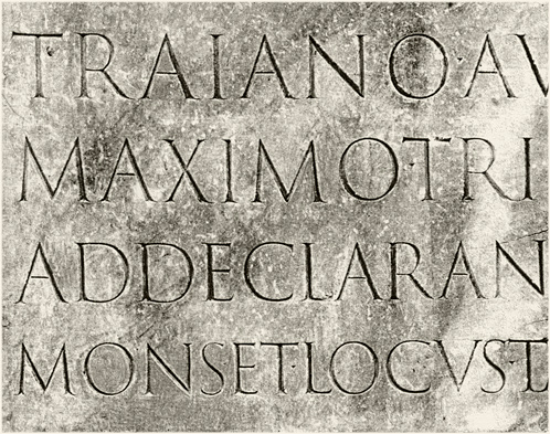
Figure 1.5 Roman inscription, Trajan's Column, Rome, C.E.
Early letterform development
- Phoenician > Greek > Roman


Figure 1.7 Evolution of letterforms from Phoenician
3rd-10th Century C.E. - Hand Script
4th/5th Century - Square Capitals:
- Were the written version found in Roman monuments.
- Serifs added to the finish of main strokes.
- Variety of stroke width was achieved by the reed pen held at an angel of approximately 60° off the perpendicular.
- Typically reserved for documents of some intended performance.

Figure 1.8 Square Capitals A-N

Figure 1.9 Square Capitals O-Z

Late 3rd-Mid 4th Century - Rustic Capitals:
- A compressed version of square capitals.
- Allowed for twice as many words on a sheet of parchment.
- Took less time to write.
- Pen/Brush was held at an angle of approximately 30° off the perpendicular.
- Slightly harder to read due to its compressed nature.
- Like square capitals were typically reserved for documents of some intended performance.

Figure 2.1 Rustic Capitals
4th Century - Roman Cursive:
- Everyday transactions were typically written in this style.
- Forms were simplified for speed.
- The beginning of lowercase letterforms in its creation stages.

Figure 2.2 Roman Cursive evolution
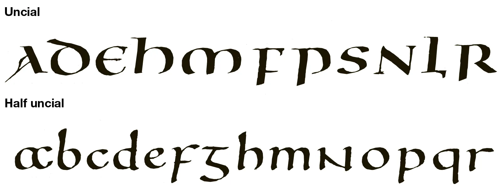
4th-5th Century - Uncials:
- ‘Uncia’ is Latin for twelfth of anything, thus some scholars think uncials refer to letters that are 1-inch (one twelfth of foot) high.
- Uncials could also be thought of as small letters.
- Incorporated some aspects of Roman cursive (especially in the shape of A, D, E, H, M, U, Q).
- The broad forms of uncials are more readable at small sizes than rustic capitals.

Figure 2.3 Uncial Script
c. 500 C.E - Half Uncials:
- A further formalization of the cursive hand.
- The formal beginning of lowercase letterforms.
- Replete with ascenders and descenders.
- 2000 years after the origin of the Phoenician alphabet.
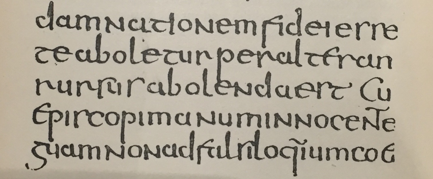
Figure 2.4 Half Uncial Script, p. 201, Handbook of Greek and Latin
Palaeography, Archives of St. Peter's, Rome, 500 C.E. the ascenders and
descenders are clearly seen here
c. 925 C.E. - Caroline Miniscule
- Charlemagne issued an edict in 789 to standardize all all ecclesiastical texts.
- He entrusted this task to Alcuin of York, Abbot of St Martin Tours.
- The monks wrote texts using both majuscules, minuscules, capitalization and punctuation which set the standard for a century.

Figure 2.6 Caroline Miniscule
Blackletter to Gutenberg's Type
- The dissolutions of Charlemagne's empire brought about regional variations upon Alcuin's script.
- A condense strongly vertical letterform.
- Gained popularity in northern Europe.
- In southern Europe, rotunda - a rounder more open hand gained popularity.
- The humanistic script in Italy is based on Alcuin.
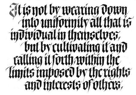
Figure 2.7 Blackletter / Textura
c. 1450 C.E. Gutenberg's Type
- Gutenberg's skills included engineering, metalsmithing, and chemistry - he marshaled them all to build pages accurately mimicking the work of the scribes hand, blackletter of northern Europe.
- His type mold required a different brass matrix/negative impression for each letterform.
- Marked the start of printing using mass-produced movable metal type in Europe and the age of printed books in the West.
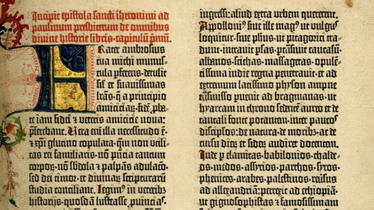
Figure 2.8 Gutenberg's Type, p. 1, Gutenberg's Bible: The epistle of
St Jerome to Paulinus, Mainz, c. 1455
Timeline
1. Humanist script to roman type

- c. 1460: Lucius Lactantius, Venice.
- 1472: Cardinal Jonannes Bessarion, Conrad Sweynheym and Arnold Pannartz, Subiaco press, Rome.
- 1471: Quintillian, Nicholas Jenson, Venice.
2. Venetian type from 1500
- 1499: Colona, type by Farncesco Griffo.
- 1515: Lucretius, type by Francesco Grifo.
3. The Golden Age of French printing
- 1531: Illustrissimae Galliaru reginae Helianorae, printed by Robert Estianne, Paris. Type-cast by Claude Garamond.
4. Dutch printing, c. 1600
- 1572: Polygot Bible (Preface). Printed by Christophe Plantin, Antwerp.
5. English type from the eighteen century
- 1734: William Caslon. Type specimen sheet, London.
6. Baskerville's innovations
- 1761: William Congreve, typeset and printed by John Baskerville, Birmingham.
- 1818 Giambatista Bodoni, Manuale Tipografico, Parma.
19th Century types → The first square serifs → Early
twentieth-century sans serif (1923 Bauhaus, Moholy-Nagy, 1959
Muller-Brockman)...
Text type classification:

Figure 2.9 Text Classification
Week 2 - Basic
In this lecture it details the technical terms used in typography mostly used to describe specific parts of the letterforms, its useful to know these terms as it helps in identification of specific typefaces.
Describing letterforms
Baseline: The imaginary line, the visual base of the letterforms.
Median: The imaginary line defining x-height of the letterforms.
X-height: The height in any typeface of the lowercase ‘x’.
.PNG)
Figure 3.0 Baseline, Median, X-height
Stroke: Any line that defines the basic letterform.

Figure 3.1 Stroke
Apex/Vertex: The point created by joining two diagonal stems (apex- above, vertex-below).

Figure 3.2 Apex/Vertex
Arm: Short strokes off the stem of the letterform.

Figure 3.3 Arm
Ascender: The portion of the stem of a lowercase letterform that projects above the median.

Figure 3.4 Ascender
Barb: The half-serif finish on some curved stroke.

Figure 3.5 Barb
Beak: The half-serif finish on some horizontal arms.

Figure 3.6 Beak
Bowl: The rounded form that describes a counter (may be open or closed).

Figure 3.7 Bowl
Bracket: The transition between the serif and stem.

Figure 3.8 Bracket
Cross bar: The horizontal stroke connecting two stems in a letterform.

Figure 3.9 Cross bar
Cross stroke: The horizontal stroke in a letterform that joins two stems together

Figure 4.0 Cross stroke
Crotch: The interior space where two strokes meet.
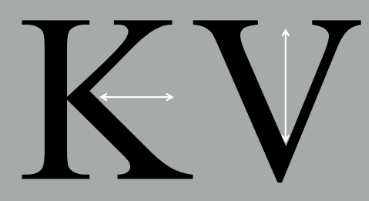
Figure 4.1 Crotch
Descender: The portion of stem of a lowercase letterform that projects below the baseline.

Figure 4.2 Descender
Ear: The stroke extending out from the main stem or body of the letterform.

Figure 4.3 Ear
Em/En: The distance equal to the size of typeface (an en is half the size of em).
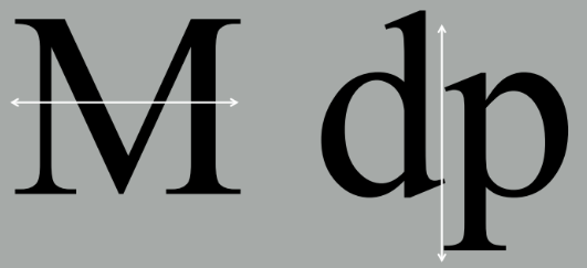
Figure 4.4 Em/En
Finial: The rounded non-serif terminal to a stroke.

Figure 4.5 Finial
Leg: The short stroke off the stem of letterform (either at bottom of the stroke-L or inclined downward-K,R).
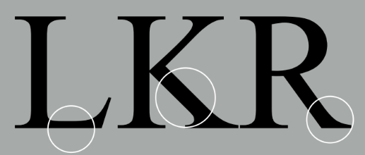
Figure 4.6
Ligature: The character formed by the combination of two or more letterforms.

Figure 4.7 Ligature
Link: The stroke that connects the bowl and the loop of a lowercase G.

Figure 4.8 Link
Loop: The bowl created in the descender of the lowercase G (in some typefaces).

Figure 4.9 Loop
Serif: The right-angled or oblique foot at the end of the stroke.

Figure 5.0 Serif
Shoulder: The curved stroke that is not part of a bowl.
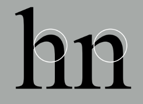
Figure 5.1 Shoulder
Spine: The curved stem of the S.

Figure 5.2 Spine
Spur: The extension that articulates the junction of the curved and rectilinear stroke.

Figure 5.3 Spur
Stem: The significant vertical or oblique stroke.

Figure 5.4 Stem
Stress: The orientation of the letterform, indicated by the thin stroke in round forms.

Figure 5.5 Stress
Swash: The flourish that extends the stroke of the letterform.

Figure 5.6 Swash
Tail: The curved diagonal stroke at the finish of certain letterforms.

Figure 5.7 Tail
Terminal: The self-contained finish of a stroke without a serif.

Figure 5.8 Terminal
Uppercase: Capital letters, including accented vowels
Figure 5.9 Uppercase
Lowercase: lowercase letters include the same characters as uppercase

Figure 6.0 Lowercase
Small Capitals: Uppercase letterforms draw to the x-height of the typeface.

Figure 6.1 Small Capitals
Uppercase Numerals: The same height as uppercase letters and set to the same kerning width.

Figure 6.2 Uppercase Numerals
Lowercase Numerals: Set to x-height with ascenders and descenders.
Figure 6.3 Lowercase Numerals
Italic: The forms in a italic refer back to 15th century Italian cursive handwriting.
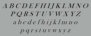
Figure 6.4 Italic
Punctuation & Miscellaneous Characters: Although all fonts contain standard punctuation marks, miscellaneous characters can change from typeface to typeface.

Figure 6.5 Punctuation & Miscellaneous Characters
Ornaments: Used as flourishes in invitations or certificates.

Figure 6.6 Ornaments
Describing Typefaces
Roman: Derived from inscriptions of Roman monuments.
Italic: Named for 15th century Italian handwriting on which the forms are based.
Boldface: Characterized by a thicker stroke than a roman form.
Light: A lighter stroke than the roman form.
Condense: A version of the roman form, and extremely condense styles are often called ‘compressed’.
Extended: An extended variation of a roman font.
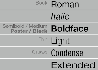
Figure 6.7 Describing Typefaces
What is worth noting isn't the similarities but rather differences, beyond the gross differences in x-height the forms display a wealth of variety in line weight, relative stroke widths, and feeling.

Figure 6.8 Comparing Typefaces 1

Figure 6.9 Comparing Typefaces 2
Week 3 - Text Part 1
Kerning and Letterspacing
Kerning: The automatic adjustment of space between letters.
Letterspacing: To add space between letters.
Tracking: The addition and removal of space in a word or sentence.

Figure 7.0 Kerning

Figure 7.1 Tracking
Formatting Text
Flush Left: Asymmetrical text where each line starts at the same point but ends where the last word on the line ends.
Flush Right: Asymmetrical text where emphasis is placed on the end of a line opposed to its start.
Centered: Symmetrical text that assigns equal value and weight to both ends of any line.
Justified: Symmetrical text where spaces between words or letters are expanded or reduced so each line starts and ends at the same point.

Texture
Different typefaces suit different messages and a good typographer has to know which typeface best suits the message at hand. For example, type with a relatively generous x-height or relatively heavy stroke width produces a darker mass on the page than type with a relatively smaller x-height or lighter stroke. Sensitivity to these differences in colour is fundamental for creating successful layouts.

Figure 7.3 Comparing Typeface Texture, best texture here is Baskerville
Different typefaces produce different gray values where some are more light or dark. The ideal is to have a middle gray value, in Fig 7.3, Baskerville achieves this well compared to the other typefaces.
Leading and Line Length
The goal in setting text type is to allow for easy, prolonged reading.
Type Size: How large or small the characters displayed are.
- Text type should be large enough to be read easily at arms length.
Leading: The space between between adjacent lines of type.
- Text set too tightly encourages vertical eye movement; a reader can easily lose their place.
- Type set too loosely creates striped patterns; it distracts the reader from the material at hand.

Figure 7.4 Bad Leading, 1- too little, 2- too much

Figure 7.5 Comparing Leading, best leading here is 10/12
- Shorter lines require less reading.
- Longer lines require more reading
- Extremely long or short line lengths impairs reading.
- Optimal line length is between 55-65 characters.
Indicating Paragraphs
There are several options for indicating paragraphs, documented below is a look at them.
Pilcrow (¶): A holdover from medieval manuscripts seldom used today.
Line Space (leading*): If the line space is 12pt, then the paragraph space is 12pt. This ensures cross-alignment across columns of text.
Standard Indentation: Typically the indent is the same size of the line spacing or the same as the point size of the text.
Extended Paragraphs: Creates unusually wide columns of text. Despite these problems, there can be strong compositional or functional reasons for choosing it.

Figure 7.6 Ways to indicate paragraphs
Widows & Orphans
Widow : A short line of type left alone at the end of a column of text.
- The solution to widows is to rebreak line endings throughout the paragraphs.
Orphan : A short line of type left alone at the start of new column.
- The solution to orphans is to carefully plan out paragraphs.

Figure 7.7 Widows & Orphans
Highlighting Text
There are many different ways to highlight text such as:
- Italic
- Bold
- Font variation
- Coloured text
- Placing a field of colour behind the text
- Bullet points
- Quotation marks
There are many kinds of subdivision within text of a chapter. A typographers task is to make sure these heads clearly signify to the reader the relative importance within the text and to their relationship to each other.
A Head: Indicates a clear break between topics within a section.

Figure 7.8 A Heads
B Head : Indicates a new supporting argument and should not interrupt as strongly as A head.

Figure 7.9 B Heads
C Head : Highlights specific facets of material within B head text.

Figure 8.0 C Heads
Cross aligning headlines and captions with text type reinforces the architectural sense of the page; the structure, while articulating the complimentary vertical rhythms.

Figure 8.1 Cross Alignment 1
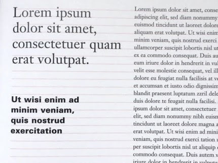
Figure 8.2 Cross Alignment 2
Week 5 - Understanding
Understanding Letterforms
The uppercase letterforms below suggest symmetry, but it is not symmetrical. There are two different stroke weights of the Baskerville stroke form. Each bracket connecting the serif to the stem has a unique arc.
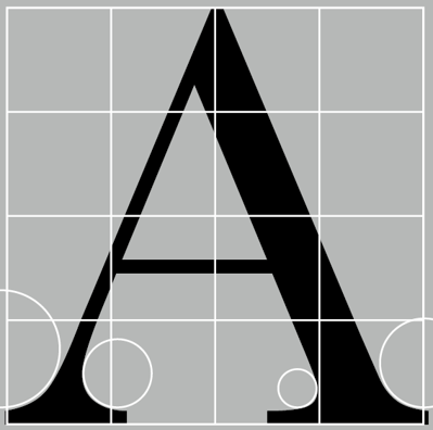
Figure 8.3 Baskerville A
The uppercase letterforms may appear symmetrical, but a close examination shows that the width of the left slope is thinner than the right stroke. Both Baskerville and Univers demonstrate the meticulous care a type designer takes to create letterforms that are both internally harmonious and individually expressive.

Figure 8.4 Univers A

Figure 8.5 Helvetica vs Univers a
Maintaining X-height
X-height: The size of the lowercase letterforms. Curved strokes, such as in ‘s’, must rise above the median (or sink below the baseline) in order to appear to be the same size as the vertical and horizontal strokes they adjoin.

Figure 8.6 Median & Baseline
Form/Counterform
Counterform (or counter); the space describes, and often contained, by the strokes of the form. When letters are joined to form words, the counterform includes the spaces between them. How well counters are handled when setting type determines how well the words hang together.

Figure 8.7 Median & Baseline
A good way to understand the form and counter of a letter is to examine them in close detail. The examinations provide a good feel for how the balance between form and counter is achieved and a palpable sense of letterform's unique characteristics and gives a glimpse into the process of letter-making.

Figure 8.8 Close up of Helvetica Black and Baskerville
Contrast

Figure 8.9 Contrast
Week 6 - Screen & Print
Different Medium: Print Type vs Screen Type
Typography in the era it is today has permeated into screen due to the times we are living in as it largely focuses on means of communication through technology- involving screens, though long before screens, typography was still prevalent in paper and print, and still continues to thrive today.

Figure 9.0 Type for print
Typography today is subject to many unknown and fluctuating parameters of screen, such as operating system, system fonts, the device and screen itself, the viewport and more. Our experience of typography today changes based on how the page is rendered, because typesetting happens in the browser.

Print Type
Primarily, type was designed intended for reading from print long before we read from screen. It's the designer's job to ensure that the text is smooth, flowing, and pleasant to read. Good typefaces for print include Caslon, Garamond, and Baskerville. They are most commonly used typefaces for print because of their characteristics which are elegant and intellectual but also highly readable when set at small font size. They are versatile, easy-to-digest classic typefaces, which has a neutrality and versatility that makes typesetting with it a breeze.

Figure 9.2 Print Type
Screen Type
Typefaces intended for use on the web are optimized and often modified to enhance readability and performance onscreen in a variety of digital environments. This can include a taller x-height (or reduced ascenders and descenders), wider letterforms, more open counters, heavier thin strokes and serifs, reduced stroke contrast, as well as modified curves and angles for some designs.
Another important adjustment- especially for typefaces intended for smaller sizes- is more open spacing. All of these factors serve to improve character recognition and overall readability in the non-print environment, which can include the web, e-books, e-readers, and mobile devices.
Hyperactive Link/Hyperlink: A word, phrase, or image that you can click on to jump to a new document or a new section within the current document. Hyperlinks are found in nearly all Web pages. Text hyperlinks are normally blue and underlined by default and when the cursor is moved over a hyperlink, whether text or image, the arrow should change to a small hand pointing at the link.
Font Size for screen: 16-pixel text on a screen is about the same size as text printed in a book or magazine; this is accounting for reading distance. Because we read books pretty close- often only a few inches away- they are typically set at about 10 points. If you were to read them at arm's length, you'd want at least 12 points, which is about the same size as 16 pixels on most screens.
Each device comes with its own pre-installed font selection which is based largely on its operating system, the problem is that each differs a little bit. Windows-based devices might have one group, while MacOS ones pull from another, and Google's own Android system uses their own as well.
If a designer picked some obscure, paid font family for their site's design. If the user does not have that font already installed and it's not pulling from a web-friendly place, the font shown would default back to some basic variation like Times New Roman which may compromise the look.
'Web safe' ones, however, appear across all operating systems. They're the small collection of fonts that overlap from Windows to Mac to Google. The fonts are Open Sans, Lato, Arial, Helvetica, Times New Roman, Times, Courier New, Courier, Verdana, Georgia, Palatino, Garamond.

Figure 9.3 Screen Type vs Print Type
Pixel Differential Between Devices: The screens used by our PCs, tablets, phones and TVs are not only different sizes, but the text you see on-screen differs in proportion too because they have different sized pixels. 100 pixels on a laptop is very different from 100 pixels on a big 60" HDTV. Even within a single device class there will be a lot of variation.

Figure 9.4 Pixel Differential Between Devices
Static typography has minimal characteristics in expressing words. Traditional characteristics such as bold and italic offer only a fraction of the expressive potential of dynamic properties.
From billboards to posters, magazines to fliers, we encounter all forms of static typography with wide ranging purposes. Whether they are informational, promotional, formal or aspirational pieces of designs, the level of impression and impact they leave on the audience is closely knitted to their emotional connection with the viewers.

Figure 9.5 Static Typography example
Motion Typography: Temporal media offer typographers opportunities to "dramatize" type, for letterforms to become "fluid" and "kinetic". Film title credits present typographic information over time, often bringing it to life through animation. Motion graphics, particularly the brand identities of film and television production companies, increasingly contain animated type.
Type is often overlaid onto music videos and advertisements, often set in motion following the rhythm of a soundtrack. On-screen typography has developed to become expressive, helping to establish the tone of associated content or express a set of brand values. In title sequences, typography must prepare the audience for the film by evoking a certain mood.
Figure 9.6 Motion Typography example, Se7en Intro Credits
INSTRUCTIONS
Task 1: Exercise 1 - Type Expression
In Exercise 1 - Type Expression, we were tasked to sketch out at least 3 ideas for each of our 4 chosen words from the 7 that we were given (Speed, Shatter, Melt, Blur, Dance, Throw, Kill), in a way where the expression of the word could be identified in the typographic design, and digitalize them later on. The words I have chosen are Speed, Melt, Blur, Kill. Below are my sketches for each word with notes to describe them better
Sketches

Figure 9.7 (Type Expression Sketches, Week 1, 8.4.2023)
Digitalization
After Mr Vinod had evaluated our sketches, we had to choose one out of 3
designs from each of the 4 words to digitalize using Adobe Illustrator, the
final designs were chosen based on personal preference as well as specific
feedback. In this section I have detailed the process I went through to
digitalize all 4 words.

Figure 9.8 (Speed Digitalization, Week 2, 12.4.2023)
Speed:
The typeface I have used here for the word Speed is Futura Std Heavy Oblique. The initial idea I had for Speed was very different as indicated by my sketch, however I stayed true to some elements such as the slanted-ness/italic, and the lines, the main changes I have made according to my feedback was on placement and number of lines I had. I started out with just the word itself only blurring "S" and "d" as the base in the first layer to make the transition to my other elements smoother, the idea was to give the illusion of those letters moving to the right in a fast manner indicating speed- to achieve this effect I added some sharp gradient lines that descended adjusting the gradient and length individually and a directional blur blending effect onto a duplicate layer of the "S" and "d".

Figure 9.9 (Melt Digitalization, Week 2, 12.4.2023)
Melt:
The word Melt was especially tricky for me as I had to digitalize it in such a way where the typeface would not be distorted too much- nonetheless I am happy with the outcome. The typeface used here is Gil Sans Std Bold. My original idea had the "l" as a candle with a flame, though I had removed it as advised by my feedback as it was an unnecessary graphical element. First, I had to arrange the letters in a way that would reflect how the word would melt into a puddle, so I typed each letter out on separate layers and rotated them individually until I was satisfied, after this I slightly rounded the corners of each letter. I then added in the actual puddle using the pen tool, and I adjusted the node points of the puddle and lower half of every letter by creating an outline to make melting effect look authentic.

Figure 10.0 (Kill Digitalization, Week 2, 12.4.2023)
Kill:
For the word Kill I have used the typeface Gill Sans MT Bold, I first
started out by creating an outline of the word so I could edit the text
paths, and splitting the lower half of the L as when I had previously
attempted to distort the letter, it didnt flow as smoothly with the
other elements and looked "squished in", so by splitting the letter, i
could adjust the node points more accurately to fit my idea, which was a
knife stab with some blood dripping from it. I then distorted the
letters to make it look like it was in the shape of a knife, and made
the handle of the knife using the vector shapes and shape builder tool,
lastly, I added in the blood and stab line with the paintbrush tool and
adjusted the node points.

Figure 10.1 (Blur Digitalization, Week 2, 12.4.2023)
Blur:
Blur was quite straightforward to create, as I had kept to a more
minimalistic theme in my sketch. I first separated the letter "U" from
the rest of the letters to its own layer, and added the radial blur
effect onto the layer that had the letters "BLR", I also made sure the
blur was not too intense as I still wanted the text to be readable. I
then added in the graphical element of a camera focus using the line
tool, and lastly, made sure everything was centered and in line with
each other.

Figure 10.2 (Final Type Expressions, Week 3, 18.4.2023)
Figure 10.3 (Final Type Expressions PDF, Week 3, 18.4.2023)
Concept & Explanation:
- Speed: Letters "S" and "d" are the ones moving forward in a fast manner as indicated by the directional blur and sharp lines designed to mimic the trail of smoke and the stretched split second image a racecar leaves when it zooms away
- Melt: The word melts and appears to sink into a puddle of itself
- Kill: Morphed into a shape of a knife that has stabbed someone as blood drips down the edge of the last "L"
- Blur: A camera focuses onto the letter "U" leaving the other letters blurred in the background.
In the last part of the Type Expression assignment, we were required to do
an animation of one chosen word from our final digitalization that would
showcase the meaning of the word in its animation, and after careful
consideration, I chose the word Speed.
Before animating, I went through the video tutorial Mr Vinod provided to get
an understanding of what we were meant to do, and shortly after, I started
planning out an idea of how I was going to animate it, and how I could
achieve the expression of the word clearly.
Planning: The idea was to have "S" and "d" move to the right fast while the
lines on them go from long to-their original length to make it look more
smooth and as if it were actually "zooming".
Process:

Figure 10.4 (Speed Animation Process of Prototype 1 in Illustrator,
Week 3, 20.4.2023)
Animation Prototype 1:
.gif)
Figure 10.5 (Speed Animation Prototype 1, Week 3, 20.4.2023)

Figure 10.6 (Speed Animation Process in Photoshop Prototype 2, Week 4, 25.4.2023)
The total amount of frames I ended up using in the final outcome is 25
frames
Animation Prototype 2:

Figure 10.7 (Speed Animation Prototype 2, Week 4, 25.4.2023)
Final animation
.gif)
In Exercise 2 - Text Formatting, the objective concerns creating a page
filled with a large mass of text that would demonstrate information
hierarchy and spatial arrangement and how we would organise and arrange
our page utilizing our knowledge of typeface, type size, line length,
leading, alignment, forced line-break, paragraph spacing, kerning,
widows, and orphans
I went through the lectures provided for this exercise and started to work on the first task at hand which was to practice kerning and tracking in Adobe InDesign using my name with the 10 given fonts. I first adjusted the leading and type size of the texts.


Details:


FEEDBACK
Specific Feedback: The animation for "Speed" needed some adjustments to make it look more cohesive which which could be solved by making the blurring effect stretch out from behind and gradually shift into the original placement as that element is present in my final digitalization, and would make more sense to the expression of the word.
Specific Feedback: First paragraph isn't aligned with the rest, it needs to be adjusted. Some tracking and kerning also needs to be worked on. Should turn on hyphenation on the 7th Paragraph as there are many uneven spaces between the words that may not be properly solved with only kerning and tracking.
REFLECTIONS
Experience
Findings
FURTHER READING

I first went through 'Legibility' as I believe it is one of the most important parts in the successful delivery of information. This section details three important qualities to look at when assessing the legibility of text as it is dependent on them; contrast, simplicity, and proportion. A good typeface should have these three characteristics and explains why the typefaces Garamond, Baskerville, and Bodoni are such timeless classics as all of them possess these qualities.

I next read the chapter 'The Typographical Message'. This section talks about how typography can be viewed and interpreted visually and heard and interpreted audibly by typographical expression. It is a dynamic communication medium that can convey different forms of information reception in how it is arranged compositionally and designed such as the concrete poem in the image below, “ping pong”. The geometric structure of the poem is composed of a repetition of the words ping and pong and as these words are repeated, they signify the sound of a bouncing ping-pong ball which helps the reader not only visualize but perhaps even audibly hear the sound in their mind.

The last section I went through was 'Typographic Design Process'. This chapter in particular was very interesting, insightful, and beneficial to read as it describes the different creative processes/phases designers go through when designing not only typography-but any art form. Some processes include, Defining- which is the immersion into the design process by defining
the problem and its parameters, Gathering-which provides the essential information
needed by the designer regarding all aspects of the problem, Ideating- thinking inside
the proverbial box where the mind should be open to lateral, sideways,
and unconventional thinking, and many many more.

.gif)
Figure 10.8 (Final Speed Animation, Week 4, 25.4.2023)
Task 1: Exercise 2 - Text Formatting
Text Formatting 1/2 - Kerning and Tracking
I went through the lectures provided for this exercise and started to work on the first task at hand which was to practice kerning and tracking in Adobe InDesign using my name with the 10 given fonts. I first adjusted the leading and type size of the texts.

Figure 10.9 (Without kerning & tracking, Week 4, 26.4.2023)
I then customized the font of each typeface, experimented with uppercase and lowercase versions, and adjusted the kerning and tracking until I was satisfied with the visuals.

Figure 11.0 (With kerning & tracking, Week 4, 26.4.2023)
Text Formatting 2/2 - Layout
After going through the videos, I started on my layout for text formatting. To start off, I pasted the given body of text into Adobe InDesign and created columns and margins. I then separated the text into the 2 columns, and started to play around with the typeface, type size, leading, and paragraph spacing until I got the desired results- which ended up being 9.7 for the type size and 11.7 for the leading, I found that these two in combination gave the ideal line length of 55-65. I also made the text sit more comfortably on the baseline grid and adjusted the cross-alignment by changing the first baseline offset to follow the leading value which mirrors the increment value as well.

Figure 11.1 (Layout Process, Week 4, 28.4.2023)
I then added in the black-&-white pictures and went through some different explorations on how I could format the text differently and ended up creating 4 versions.

Figure 11.2 (Layout Exploration, Week 4, 28.4.2023)
After some feedback from my family and peers, as well as comparing the 4 with each other, I have settled with the 4th layout as it looked compositionally interesting, the mirroring between the body of text and the pictures make a good contrast.

Figure 11.3 (Text Formatting Prototype, Week 4, 28.4.2023)
After I had received some feedback from Mr Vinod, I took into account the issues that were pointed out in my Prototype such as the 1st paragraph not being properly aligned with the rest of the body of text and some issues I had with tracking and kerning, I then went back into InDesign and adjusted them accordingly to what was mentioned.
Final Text Formatting
Heading
Typeface: Janson Text LT Std
Font: Roman + Bold
Type size: 30 pt + 46 pt + 9.7 pt
Leading: 36 pt
Kerning: -150
Colour Fill: Black + Grey
Body
Typeface: Janson Text LT Std
Font: Roman
Type size: 9.7 pt
Leading: 11.7 pt
Paragraph Spacing: 4.127mm
Characters per-line: 60
Colour Fill: Black
Alignment: Left Justified
Captions
Typeface: Janson Text LT Std
Font: Bold Italic
Type size: 7 pt
Leading: 8.4 pt
Colour Fill: Grey
Alignment: Left + Right
Settings
Margins: 12.7 mm top + left + right, 40.7 mm bottom
Columns: 2
Gutter: 5 mm

Figure 11.4 (Final Text Formatting, Week 5, 3.5.2023)

Figure 11.5 (Final Text Formatting with baseline grid, Week 5, 3.5.2023)
Figure 11.6 (Final Text Formatting PDF, Week 5, 3.5.2023)
Figure 11.7 (Final Text Formatting with baseline grid PDF, Week 5, 3.5.2023)
FEEDBACK
Week 2
General Feedback: For this weeks class, Mr Vinod reviewed some of our ideas for Exercise
1: Type Expression. He went through a couple examples from our class
and pointed out the general mistakes we were making; having our
designs be too graphical instead of typographic, not representing the
meaning of the word well enough in the design, having too many
elements in the design, not being exploratory enough in ideation, and
the letters not being very strategically placed. With this, he
gave us some questions we could ask ourselves in order to better
improve on our work which were the following;
- Are the explorations sufficient?
- Does the expression match the meaning of the word?
- On a scale of 1–5, how strong is the idea?
- How can the work be improved?
Specific Feedback: Most of the ideas I had come up with were good/acceptable, Mr Vinod
mentioned he particularly liked my 1st designs for Speed and Melt, my
1st and 2nd designs for Blur, and my 3 designs for Kill, however, he
advised me that some of my designs could have done without the extra
graphic elements I added in as the expression of the word was already
conveyed well enough without them- like for Speed, he pointed out the
underline beneath the word was not needed as the lines I had
throughout the design were enough and showed the words expression.
Week 3
General Feedback: Many designs people came out with were creative and good, but some did not use the typefaces given or were overly distorted and too graphical, so we were reminded to keep the distortion at a minimum and to keep it minimal as it does not take much to convey the meaning of the word. Watching other people's feedback gave me a good idea on what areas I needed to improve on for my work.
Specific feedback: The designs "Speed" and "Melt" needed some tweaking, it was mentioned I did not need to use as many lines in my design for "Speed" to express the meaning as it could still be achieved using less of them, and to remove the candle flame and slightly round of the corners of the typeface slightly for "Melt". The other 2 designs were good/successful as is and did not need any adjustments since it was expressed well.
Week 4
General Feedback: Make sure there is a pause in the animation at the
end so the sequence is clear and that the animation clearly shows the
expression of the word chosen. We were also advised to ensure our
animations ran smoothly and weren't choppy, this could be achieved
with more frames as it was mentioned that 24 frames per second was
ideal.
Specific Feedback: The animation for "Speed" needed some adjustments to make it look more cohesive which which could be solved by making the blurring effect stretch out from behind and gradually shift into the original placement as that element is present in my final digitalization, and would make more sense to the expression of the word.
Week 5
General Feedback: Make sure the typeface and font size is readable, which usually falls between 8-12 when it comes to A4 documents. Line length should also be about 55-65 as it is ideal, the ragging should be organically smooth, column spacing should be a minimum of 5mm, make sure there arent any orphans. Mr Vinod also gave us some questions in order for us to judge our work better
- Is kerning and tracking appropriately done?
- Does the font size correspond to the line-length, leading & paragraph spacing
- Is the alignment choice conducive to reading?
- Has the ragging been controlled well?
- Has cross-alignment been established using base-line grids?
- Are widows and orphans present?
REFLECTIONS
Experience
The first task was particularly challenging as there was much work to be completed in a short span of time, I had a bit of trouble visualizing ideas for the type expressions sketches and some trouble implementing the elements I wanted to achieve in my animation, aside from this, while going through the exercises I was also learning the functions of the Adobe programs and how its tools worked, thus there were many instances of trial and error where I had to re-do the typographical designs from scratch, or make some adjustments. Nonetheless I ended up quite satisfied with the outcome, and was pleased with the results of my hard labour. The second task was much more technical, it required lots of knowledge from the previous lectures and I spent a considerable amount of time going through them to properly tackle the second task, despite this, I still had a few issues- which were later resolved as Mr Vinod gave his feedback and guided me into the right direction, and I ended up pleased with the final result of the 2nd task as well. Though I have been very tired throughout, my experience was nonetheless a positive one as I believe the information I have learned here will prove to be useful in the upcoming future.
Observation
Throughout the weeks, watching Mr Vinod give feedback to others gave me a better understanding on how to properly conduct and/or approach certain areas that I needed to work on if such applied to me, thus I listened to others feedback intently so I could take everything into consideration, observing others and their work has also given me a better sense of perspective as seeing how others visualize and express text differently really inspired me in my own work and helped me gain an understanding of how interpretation vastly differs from individual to individual.
Findings
Typography is much more of a detailed, technical, and meaningful art-form than I had previously realised, before this, I had not known such a great amount of effort that goes into just a single page or even title, there are many minute details to consider that can bring out an entire design so actual 'good typography' can be achieved. From the experience of going through these two tasks, I learned so much valuable information- from considering the meaning and intention behind a text's design, to composing a harmonious layout- it has definitely enlightened me in the world of typography which has brought about a newfound respect in me for those who do typographical work professionally. Most of all, I learned how much of an important art form typography is as it plays a huge role in communication where it is so present in our every day lives, from the text to our phones, to street signs, typography can be seen everywhere, thus a good use of typography should always be the end goal in order for successful delivery of information.
FURTHER READING
The book I have chosen to read for this section is 'Typographic design: Form and communication' as it was one of the books recommended by Mr Vinod since it contained extra insightful information that we could learn aside from our lectures.
Figure 11.8 Typographic design: Form and communication
Figure 11.9 Legibility
I next read the chapter 'The Typographical Message'. This section talks about how typography can be viewed and interpreted visually and heard and interpreted audibly by typographical expression. It is a dynamic communication medium that can convey different forms of information reception in how it is arranged compositionally and designed such as the concrete poem in the image below, “ping pong”. The geometric structure of the poem is composed of a repetition of the words ping and pong and as these words are repeated, they signify the sound of a bouncing ping-pong ball which helps the reader not only visualize but perhaps even audibly hear the sound in their mind.
Figure 12.0 The Typographical Message
Figure 12.1 Typographic Design Process
In conclusion, this book was a great read that gave me a wealth of knowledge on one may feel about a message, the associations one makes when reading or looking at something, and ultimately, the overall methods in successfully communicating with typography.


Comments
Post a Comment