Information Design / Exercises
03.02.25 - 21.02.25 / Week 1 - Week 3
Name: ALYSSA AISYAH BINTI 'ARIEF NASRAN (0364017)
BDCM
Information Design (DST61004)
Name: ALYSSA AISYAH BINTI 'ARIEF NASRAN (0364017)
BDCM
Information Design (DST61004)
INSTRUCTIONS
LECTURES
Week 1
Infographics
Infographics are highly effective when it comes to increasing engagement and capturing your audience’s attention. An infographic is a powerful way of communicating ideas in a visual form. Different types of infographics are used in design and marketing to present information in a simple and visually appealing way. They can be a useful alternative to standard text-based content.
Type of Infographics
- List infographics
- Statistical infographics
- How-to infographics
- Timeline infographics
- Comparison infographics
- Map and location infographics
- Flowchart infographics
- Process description infographics
List Infographics
- Present information through written lists combined with engaging design elements.
- The addition of visuals makes factual points more memorable and visually appealing.
 |
| List Infographics Example |
Statistical Infographics
- Include charts, graphs, and other data-based visuals to highlight numerical information.
- Transform raw statistics into easily digestible, eye-catching content.
 |
| Statistical Infographics Example |
How-to Infographics
- Provide step-by-step instructions or processes.
- Use concise copy and clear visuals to guide the viewer in learning a specific task or concept.
 |
| How-to Infographics Example |
Timeline Infographics
- Showcase chronological information in a linear, engaging format.
- Rely on icons and illustrations to help users follow events over time.
 |
| Timeline Infographics Example |
Comparison Infographics
- Compare and contrast multiple options side-by-side.
- Help readers visualize similarities and differences to aid in decision-making.
 |
| Comparison Infographics Example |
Map or Location Infographics
- Depict data tied to specific regions or geographic contexts.
- Commonly used to convey demographic, cultural, or regional statistics.
 |
| Map/Location Infographics Example |
Flowchart Infographics
- Visually present a sequence of steps or actions.
- Offer an interactive feel by guiding viewers through a personalized path of information.
 |
| Flowchart Infographics Example |
Process Description Infographics
- Break down more complex tasks or systems into major stages.
- Highlight key steps and group them logically for easier understanding.
 | |
|
Week 2
L.A.T.C.H Theory
 |
Latch System Infographic |
LATCH stands for:
L - Location
A - Alphabet
T - Time
C - Category
H - Hierarchy
Location
- Structures data according to physical or spatial context.
- Helps users find information by linking it to a specific place.
 |
| Location Example |
Alphabet
- Groups information in alphabetical order.
- Universally recognizable structure that ensures quick navigation, but labels must be clear and user relevant.
 |
| Alphabet Example |
Time
- Relies on chronology to sort and prioritize content.
- Especially helpful in contexts like social media feeds where recency is crucial.
 |
| Time Example |
Category
- Clusters content into meaningful groups based on shared traits.
- Card sorting and similar tools can help create categories that resonate with user expectations.
 |
| Category Example |
Hierarchy
- Organizes information by ascending or descending criteria, such as size, cost, or popularity.
- Assists users in comparing items and making more informed decisions.
 |
| Hierarchy Example |
Week 3
Miller's Law of Memory
Communication can be a messy endeavor, with interruptions happening frequently and misunderstanding affecting the way the message is carried across to other participants. Miller's law suggests how our short-term memory is limited when it comes to remembering more than seven information "objects," and how retaining that information does not last longer than 30 seconds.
Miller’s Magical Number Seven
- Humans can typically hold around seven items (± two) in short-term memory.
- Exceeding this threshold results in forgetting or losing track of certain details.
 |
Miller’s Magical Number Seven Example |
The Paradox of Choice
- More options or pieces of information do not always benefit the user.
- Our minds can become overwhelmed, making us less likely to remember everything.
 |
| The Paradox of Choice Example |
Refining Options
- Breaking content into smaller, digestible chunks, known as clustering, helps memory retention.
- The goal is to stay within the brain’s capacity for short-term recall, ensuring a clearer understanding of information.
 |
Refining Options Example |
Week 4
Manuel Lima's 9 Directives Manifesto
Manuel Lima’s Information Visualization Manifesto provides a working list that can help provide clarity on what Information Visualization through 9 directives, and why information visualization differs from information art or infographics.
Form Follows Function
- Focus on clarity and insight, driven by a central question.
- The design should serve the explanation, never overshadow it.
Interactivity is Key
- Engage users by allowing them to explore the data.
- Encourage investigation and discovery through interactive elements.
Cite Your Source
- Always credit the origin of your data.
- Transparency builds credibility and trust.
The Power of Narrative
- Weave storytelling into visualizations.
- A strong narrative makes information more memorable and engaging.
Do Not Glorify Aesthetics
- Aesthetics should arise from clarity of information.
- Avoid prioritizing style over substance.
Look for Relevancy
- Determine the purpose behind your visualization.
- Only present information that serves a clear and meaningful goal.
Embrace Time
- Recognize time’s complexity in data visualization.
- Organize and present temporal data effectively to improve decisions.
Aspire for Knowledge
- Translate raw data into knowledge, enhancing understanding.
- Aid cognition by making information accessible and insightful.
Avoid Gratuitous Visualizations
- Visualization should filter and clarify, not add noise.
- Keep it purposeful, focused, and user-centric.
Week 5
Constructive Workflow
Constructive Workflow focuses on aligning your thinking process with a systematic approach to planning and producing digital work.
Understand the Question
- Emphasize asking the right question over simply looking for answers.
 |
| Understand the Question |
Construct a Strategic Plan
- Evaluate data & information.
- Identify pros and cons.
- Create a content creation plan.
- Understand your outcome.
- Build case studies.
 |
| Construct a Strategic Plan |
Fill in the Blank
- Create empty folders as a structure.
- Fill in each folders with a progress.
- Synchronize all working files for each software requirements.
 |
| Fill in the Blank |
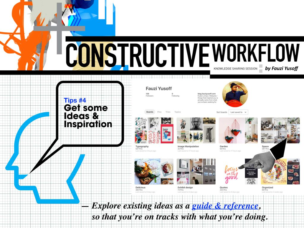
Get Some Ideas & Inspiration
- Seek references and existing works for guidance.
- Use them only as benchmarks to keep your projects aligned with current standards, yet distinct.
 |
| Get Some Ideas & Inspiration |
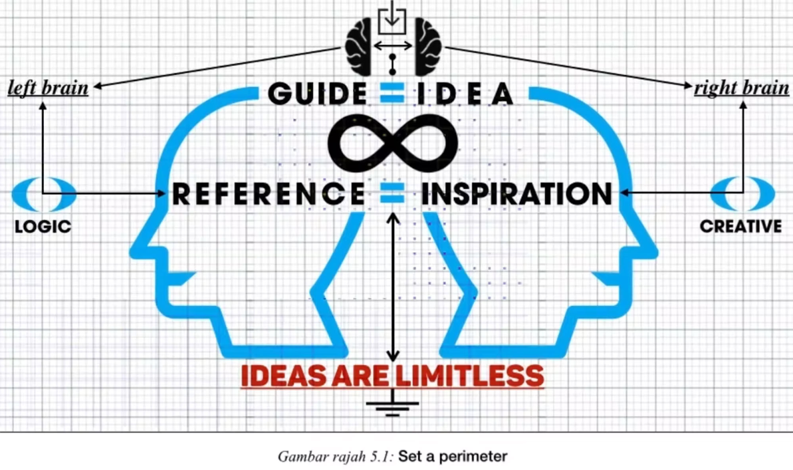
Set a Perimeter
- Ideas are limitless.
- Time is a constraint.
- Identify your strengths.
- Reference is just a benchmark.
- Solution is the answer.
 |
| Set a Perimeter |
Balance Thinking
- Aim for balanced thinking (left-brain logic with right-brain creativity) to generate effective solutions
Balance Thinking
EXERCISES
Exercise 1: Quantifiable Information
Instructions
For the first exercise of information design, we are to gather a set of
objects and separate it into category such as color, shape, pattern, and
other quantifiable factor. We must also arrange them into a presentable
layout or chart with relevant indicators written out with pens to help in
visualising the quantity and data. The examples of objects that can be use
are buttons, coins, lego pieces, M&Ms, and more.
The requirements are the following:
- Photo of the random objects before sorting out
- Objects sorted out by categories (2 - 5 category)
- Write and design the information on a piece of papers (A3 drawing paper)
Process
First I gathered all my buttons. In total I had 101 buttons.

Fig 0.1 Random Raw Data
Then I sorted them by colour,
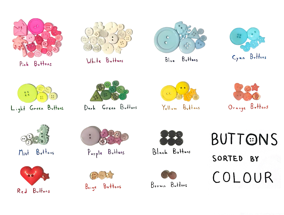
Fig 0.2 Sorted
by colour and size,

Fig 0.3 Arranged
and finally by colour, size, shape, length, quantity, and button type,

Fig 0.4 Presented Visually
Finally I used them to tell a story of earth's biodiversity and the interconnectedness of life.
Final Outcome

Fig 0.5 Telling a Story
All of the buttons coalesce into one, unified flower. Each colored button
represents the petal of a different flower, to represent the natural
biodiversity and varied beauty of flowers in nature which is also represented
by the buttons coming in all shapes, sizes, colors, all serving their own
aesthetic purpose. But they all serve the same purpose, just in different
ways, for different reasons, or for different visual preferences, and so they
are all united as one which demonstrates their aesthetic contrast but unity in
purpose. Just like flowers of all types in nature, we understand them all as
"flowers" but have varied purposes and can be used differently for different
purposes. There is a dichotomous contrast between the natural and the
synthetic, flowers and buttons, yet they are not so different after all. At
the core of the flower is a flower button of each of the individual colors,
showing that each color petal at its essence represents an individual,
separate flower which come together into the uniform flower. It takes on a
sort of self-similar fractalization shape in this way. The animal buttons
within the flower symbolizes the unity of life, coming together from the same
origin, but also because animals help plants as well- like how bees pollinate
flowers, or how their decaying bodies act as fertilizer for plants to nourish
themselves with, and so this is why this flower is the Flower of Life. Just
like the Kabbalah as the Tree of Life, it represents the nature of the
universe and the interconnectedness of all existence.
Exercise 2
Instructions
For the second exercise of information design, we are to organize a group of information into a visual infographic poster that combines and utilizes the LATCH principles (Minimum 4) utilising a digital photo editing/illustration software. We are allowed to reuse readily available images online but must create other visuals to complete the poster.
Research
Initial Ideas
- SCP Foundation
- The Backrooms
When consulting, I presented the these two ideas since by nature they already have many categorical elements as part of their stories.
1st Idea - SCP Foundation:
The SCP Foundation is a fictional secret organization dedicated to securing, containing, and protecting supernatural or anomalous entities, objects, and phenomena. Their goal is to keep these anomalies hidden from the public to maintain normalcy and prevent chaos. The Foundation operates with strict protocols, advanced technology, and a classified network of facilities worldwide.
The SCP universe is built around a massive online collaborative writing project on the official website, featuring thousands of SCP entries, detailed reports on different anomalies, each with unique properties, containment procedures, and sometimes even deep lore. It is a mix of science fiction, mystery, and horror, with a strong focus on secrecy, danger, and the unknown.
Since the foundation deals with so many different anomalies, they are all named differently numerically and even given nicknames, and split into different categories such as the object class system which describes how dangerous/difficult an anomaly is and or to contain. There is also a natural hierarchy based on the object class system, from least to most dangerous, thus it seemed like a good option for the project.
Initial Classification Ideas
Location - Map of SCP facilities and known anomaly locations.
Alphabet - A-Z list of notable SCPs and their nicknames (e.g., SCP-049, SCP-173, SCP-682).
Time - Timeline of major SCP discoveries, containment breaches, or key
Foundation events.
Category - SCP Object Classes (Safe, Euclid, Keter, etc)
Hierarchy - Ranking SCPs by danger level/containment difficulty.
Initial Visual Poster Ideas
Facility map pinpointing SCP containment locations
An A-Z sidebar listing major SCPs with descriptions
Timeline of critical SCP events (containment breakthroughs, breaches, site
disasters)
Colour-coded chart categorizing SCPs by Object Class.
Pyramid ranking SCPs by danger level (e.g., harmless → reality-breaking
entities)
-----
2nd Idea - The Backrooms:
My second idea was The Backrooms, which is quite similar to what the SCP Foundation is being an online fictional story that people can contribute to on their official website as well. The concept is about a vast, interconnected maze of liminal spaces that exist outside of normal reality, made up of countless levels, each with its own unique environment, rules, and dangers. Some levels resemble abandoned buildings or endless tunnels, while others defy logic entirely featuring floating structures or strange landscapes and scattered throughout some levels are entities- some hostile, some neutral, and some entirely unknown as well as items that may or may not help you. Those who end up in the backrooms must navigate their way through the unpredictable landscape and challenges of each level if they wish to escape.
The categorical nature of the story works similarly, as the levels have different difficulty/survivability depending on what it contains as some are more safe or dangerous than others which is why it was another idea I had.
Initial Classification Ideas
Location - Map of different Backrooms levels and their
connections.
Alphabet - A-Z list of notable entities, levels, or items
(e.g., The Hound, The Smiler, Almond Water).
Time - Timeline of explorers' discoveries and Backrooms lore
events
Category - Levels grouped by hazard level (Safe, Unsafe, Dead
Zone, etc)
Hierarchy - Ranking levels by difficulty or survivability
Initial Visual Poster Ideas
Network-style map showing how different levels connect.
An A-Z section highlighting creatures or objects
Timeline of Backrooms expeditions/discoveries/lore events
Table categorizing levels by difficulty and danger
Survival guide ranking levels from safest to deadliest
-----
After consulting more I was told I could pick any idea as they were both good and interesting, and after deliberation I settled on my 1st idea; the SCP Foundation, since I thought it fit the project better and would be more visually interesting as a poster as there is somewhat of a consistent theming unlike the backrooms story.
Following this I then finalised the information into LATCH principles.
Final Classification
Location - Map of an SCP site and the containment locations for each SCP in the poster.
Alphabet - List of notable SCPs and sorting their nicknames by alphabetical order (e.g. "Plague Doctor", "Shy Guy", "Tickle Monster")
Time - N/A
Category - SCP Object Classes (Safe, Euclid, Keter) + Hazard Classes (Cognitohazard, Sentient Object, etc)
Hierarchy - Ranking SCPs by danger level/containment difficulty from bottom to top
I chose to do the most popular SCPs, as they were ones that were given nicknames by the community, so the Alphabet part of LATCH could be achieved as well. However I chose to not include time as even with the most popular SCPs, some did not include any sort of time stamps I could implement into the poster since part of the writing on the website is "redacted" to maintain secrecy, enhance mystery, and prevent dangerous details from being exposed, both in-universe for security and narratively to engage readers.
Chosen SCPs + Classifications
Safe, Euclid, and Keter describe containment difficulty, while classifications such as "sentient object" describe the nature or properties of the anomaly. Each SCP is also sorted alphabetically.
SAFE (Easily and safely contained; anomalies that pose little to no threat as long as proper procedures are followed)
- SCP-131 ("Eye Pods") - Two small, friendly, teardrop-shaped creatures with a single large eye each. They follow people around, are affectionate, and completely harmless. → SENTIENT OBJECT
- SCP-914 ("The Clockworks") - A large mechanical device that can refine objects placed inside, altering them in unpredictable ways based on the chosen setting. → NONSTANDARD SPACETIME
- SCP-999 ("Tickle Monster") - A playful, orange, gelatinous blob that brings extreme happiness and relieves stress, sadness, or other negative states in anyone who is in its presence → SENTIENT OBJECT
EUCLID (Unpredictable; anomalies that require special containment measures due to unknown or inconsistent behavior)
- SCP-079 ("Old AI") - A highly intelligent, self-aware computer program stored in outdated hardware with a bad attitude and a desire to escape containment → SENTIENT OBJECT
- SCP-049 ("Plague Doctor") - A humanoid wearing a plague doctor outfit that believes it must "cure" people, reanimating them into living corpses → SENTIENT AND VIOLENT
- SCP-096 ("Shy Guy") - A tall, thin humanoid that becomes extremely distressed and dangerous if anyone sees its face, relentlessly pursuing them no matter where they are → COGNITOHAZARD
KETER (Extremely dangerous; anomalies that are difficult or nearly impossible to contain, often posing a major threat)
- SCP-682 ("Hard-to-Destroy Reptile") - A massive, highly intelligent, and nearly indestructible reptilian creature that hates all life and adapts to survive anything thrown at it → SENTIENT AND VIOLENT
- SCP-106 ("The Old Man") - A decayed-looking humanoid that can phase through solid matter and drag people into a personal pocket dimension filled with unknown horrors → SENTIENT AND VIOLENT
- SCP-939 ("With Many Voices") - Pack-hunting creatures that lack eyes but mimic human voices to lure prey into traps → SENTIENT AND VIOLENT
Process
First I created the border design and separated the page into two major sections. The top for the object class, hierarchy, and SCPs, and the bottom for the site map and containment locations. I made the border design similar to warning tape since the C in SCP stands for "contain" so it fits well with the theme.

Fig 0.6 Designing Border
Then I added in the text for the two sections. The logo on the top left to indicate the source, anomaly object class on the top right, and the site number with the subtext "containment chambers" to inform infographically and give context to what you are looking at when observing each section.

Fig 0.7 Addition of Text
Then I added the hierarchy of safe, euclid, and keter and the text "! danger level" on the left so it is clear that the hierarchy refers to how dangerous these SCPs are from bottom to top. I've also coloured them with the common colour associations for each category, like "safe" being green, and "keter" being red to convey the idea more visually as well. I also added boxes and separators where I will be putting the SCP anomalies, and description of what each category in the hierarchy means. Then I created the map layout of how I imagine site-19 looks like, referring to an SCP game called "Secret Lab" which had the site structure possibilities mapped out, and labelled each zone with EZ (entrance zone), HCZ (heavy containment zone), and LCZ (light containment zone).

Fig 0.8 Addition of Boxes, Hierarchy, Map,
To get the object classes I used this image of the object class labels and cropped out the ones I was using.

Fig 0.9 SCP Object Classes
Then I added the unique object classification of each SCP anomaly next to the pictures of them which I found on the official site for their wiki entries into the correct danger level category, the designated SCP number matching the hierarchy category along with their nicknames in alphabetical order left-to-right, and the descriptions of what safe, euclid, and keter mean. I also sorted the SCP anomalies into their containment chambers onto the map to indicate their canonical locations, along with labelling their designated numbers next to them for clarity.

Fig 1.0 Addition of Object Classes, SCP Anomalies, Nicknames, Numbers, & Description
I still felt like there was something missing however, so I decided to add a tv static version of the SCP logo at the back to reinforce the entire theme of the foundation being a mysterious and secretive classified entity. I imagine the poster as an infographic file used as training for employees on site-19, known for being one of the most heavily guarded and dangerous sites due to the many difficult to contain and dangerous SCP anomalies which are being kept there. To do this, I lowered the logo transparency so it wouldn't be too visually distracting, then layered tv static onto it.

Fig 1.1 Addition of Logo

Fig 1.2 Layering TV Static

Fig 1.3 TV Static SCP Logo
Lastly I applied this rough, scratchy texture onto the poster to enhance the dark atmosphere and theme of site-19, and some light dried blood splatter effects.

Fig 1.4 Texture

Fig 1.5 Addition of Texture

Fig 1.6 Addition of Dried Blood Splatter
Final Outcome
L - Location of SCP anomaly containment chambers in Site-19
A - SCP Nicknames, Anomalies arranged alphabetically left-to-right, e.g → "Clockwork", "Eye Pods", "Tickle Monster"
T - N/A
C - Object Classification (Nonstandard-Spacetime, Sentient Object, Sentient and Violent, Cognitohazard)
H - Danger Level/Containment Difficulty (Safe, Euclid, Keter)

Fig 1.7 Final LATCH Infographic
FEEDBACK
Week 1
Good selection of objects, try to sort them by different categories such as shape, colour, etc. Good sorting so far on colours and size.
Week 2
You can pick any idea, both are good and interesting, just make sure you can apply LATCH to them.
REFLECTION
These exercises in information design taught me how to creatively organise and communicate data through visual storytelling. I'm used to organising and sorting things well, so these exercises felt natural to me, though I did encounter challenges in categorizing ambiguous elements in the first exercise, like distinguishing between flower and plant buttons, which made me to think more critically about how we define and group information. The visual storytelling part was the hardest since I had to construct some kind of story to what seemed to me like just a pile of buttons, but in the end, after thinking about it more, the categories I derived from it like the flower helped me create a symbolic piece of design, which also reinforced to me how visual layouts can convey my abstract ideas and not just the raw data I had.
For the second exercise I had a lot of fun with it since I was working on something I had a personal interest in and was very familiar with. I liked the idea of being able to create something for a personal interest, and it was fun applying the LATCH principles to it since it already naturally followed the principles. I enjoyed how it also allowed me to explore digital composition/thematic storytelling in more depth, as this was fictional information, I had to turn it into a coherent infographic, so that was a fun challenge too.


Comments
Post a Comment