Typography / Task 2 Typographic Exploration and Communication
01.05.23 - 19.05.23 / Week 5 - Week 7
Name: ALYSSA AISYAH BINTI 'ARIEF NASRAN (0364017)
Name: ALYSSA AISYAH BINTI 'ARIEF NASRAN (0364017)
BDCM
Task
2: Typographic Exploration and Communication
LECTURES
Refer to Task 1
INSTRUCTIONS
Task 2: Typographic Exploration and Communication
In Task 2, we are required to create a 2 page editorial spread by selecting 1 of 3 text options provided, then using the contents of the body of text we have chosen, we must then compose and express it typographically in Adobe inDesign. The requirements are the following - 200mm x 200mm, no images allowed, use the 10 typefaces given, fully greyscale, only minor graphical elements are allowed - i.e. line, shade.
I first went through the 3 text options provided for the task at hand; The role of Bahaus thought on Modern Culture, A code to build on and live by, and Unite to Visualize a better word. After going through all three and examining the contents of each, I decided to pick the 2nd option: A code to build on and live by, the text describes the code of ethics a designer should have when carrying out their work while also detailing the effects and impact it has on the environment around them. I had given quite a bit of thought for which to choose- trying to visualize how I would format the text for each of the 3 into different layouts, though the body of text for the 2nd options was significantly longer than the other two, I found the content within it interesting and had better ideas for this option than the latter, thus, I solidified my choice.
Before going into my sketches and the designing process, I wanted to do some research on editorial spreads/layouts as though I had ideas for the body of text I had chosen, they were very rough ideas, and I figured looking at more professionally made editorial work would give me better sense of direction, helping me gain a better sense of understanding of how to properly formulate a layout, as well as help with the ideation process to become much more clear and defined.
Research

Fig 1.1 (Editorial Spread Anatomy, Kevin Fay)

Fig 1.2 (Editorial Spread Example 1, Nicolas Zentner)

Fig 1.3 (Editorial Spread Example 2, Joanna Tyborowska)
After visualizing out some ideas on what I wanted my layout to look like having been inspired from the research I conducted, I then created a few sketches in order to explore the different layouts to choose from later and have come out with 3 designs.
Sketches
Layout Design #1

Fig 1.4 (Layout Design 1, 7.5.2023)
In this first layout design, I thought of highlighting the word "a code" differently from the actual context of the body of text in the computing sense, using the angle brackets at the start and end of the highlighted text like how actual code is typed out as a creative way to express the title differently, the grey boxes represent the body of text, and I have arranged them in a manner where the 2nd page would also highlight the important ending text in the very middle to emphasize information hierarchy.

Fig 1.5 (Layout Design 2, 7.5.2023)
For the second layout design, I decided to go with a different approach by making the title in the very middle of the spread and surrounding it with the body of text. In this design, I highlighted the word "code" using a serif font for the word, and with bullet points next to each letter. The title is expressed in a way that accurately depicts the content of the body of text, having the word "code" coming down with bullet points as if it were a true set of rules being written down in point form, I also chose a serif font in specifically as the serif-finish in each letter- in particular the letters "C" and "E" would allow me to create lines to have the rest of the title text sit comfortably on where the serif finishes are.

Fig 1.6 (Layout Design 3, 7.5.2023)
In the third layout design, instead of highlighting the word "code" like the my previous layout designs I decided to highlight the word "build" instead, expressing it with lines designed to mimic building blocks or bricks and sitting each letter on one so it looked as if the word was "building" upwards on the word "on" thus creating a design that can be also taken quite literally while still relating to the context from the body of text, the rest of the title being placed under the line the blocks connect to. I then separated the body of text into 5 neat sections.
Title
As Mr Vinod stated, we were allowed to design our titles in Adobe Illustrator, but only with minor graphical elements such as lines, shade. Thus I began to design my titles based on my sketches, choosing different fonts and compositions to give a different tone and feel for each title.

Fig 1.7 (Title Creation, 8.5.2023)

Fig 1.8 (Title Design 1, Serifa Std, 55 Roman, 8.5.2023)

Fig 1.9 (Title Design 2, ITC New Baskerville Std, Roman, 8.5.2023)

Fig 2.0 (Title Design 3, Univers LT Std, 67 Bold Condensed, 8.5.2023)
Layout Process
Once I had finished designing my titles, I began to format the text in Adobe InDesign based on my sketches while adjusting some elements from the sketches to better fit the composition I was going for in each layout. I first started out with creating margins and columns for each page and laid out the body of text, arranging them following the layout of my sketches, and using left justify for all as I appreciated the clean look it gave, and turned off hyphenation as I did not want any words to be cut off. I had also decided to highlight each sub-title for each paragraph by making it bold to indicate to the reader that it was a separate point/code from the last.
Other than this, I experimented with a few typefaces, type size, and leading for each individual spread until I had gotten a desired line length that would be comfortable to read (about 55-65) and made sure I had text that was not too small and straining on the eyes, but also not too big that it took up too much space, and through trial and error, I found that a type size of 9pt, and a leading of 10.8 for all 3 spreads ended up being ideal to fulfill those requirements. Moving on, I then aligned the text to the baseline grid, making sure I achieved cross alignment by offsetting the first baseline to follow my leading number and increment value, and then tinkered with the kerning and tracking for each spread to ensure uneven spaces between words were eliminated.

Fig 2.1 (Layout Process, 8.5.2023)

Fig 2.2 (Prototype Editorial Spread 1, 8.5.2023)

Fig 2.3 (Prototype Editorial Spread 2, 8.5.2023)

Fig 2.4 (Prototype Editorial Spread 3, 8.5.2023)
During the class for week 6, Mr Vinod evaluated my 3 prototypes. The 1st one was rejected as the title design was too uninspiring and boring to look at, the 2nd one was not advisable as the headline was in the middle where the gutter was, and the line length for it was too long, finally, he evaluated the 3rd one and said he liked it the best as title is expressed well and is the more better composed layout out of the 3 so I could proceed with it, however, he also pointed out some issues that I ought to fix such as the ending text as it didn't align with the margins and looked a bit awkward with the whole layout as well as a few kerning and tracking issues.
Furthermore, I also took into account the general feedback he gave being that the line length of all texts must match when the content is related to each other and how a design needs to have meaning in the elements used. With all of this in mind, I went back into Adobe InDesign and made the advised adjustments. I decided to make the title stand alone in the 1st page of the spread and move the 1st paragraph to the 2nd page where the rest of the text is so the content wouldn't look separate from each other, rearranging the paragraphs so it could fit nicely together, and finally, I adjusted the ending text by making it sit in 1 textbox instead of 3 separate ones, moved the word "choice" to come after the words "your job is", solved the issues spacing issues in some paragraphs with tracking and kerning and made sure the spacing was even and aligned with the margins.

Fig 2.5 (Layout Adjustments, 11.5.2023)
Final Typographic Exploration and Communication
Details:
Heading
Typeface: Univers LT Std
Font: 67 Bold Condensed
Type size: 168 pt
Leading: -
Kerning: -
Colour Fill: Black
Body
Typeface: Futura Std
Font: Book (Body) Heavy (Subheading)
Type size: 9 pt (Body) 11 pt (Subheading)
Leading: 10.8 pt
Paragraph Spacing: 0mm
Characters per-line: 59
Colour Fill: Black
Alignment: Left Justified
Ending Text
Typeface: Futura Std
Font: Heavy
Type size: 18 pt
Leading: 10.8 pt
Colour Fill: Black
Alignment: Center Aligned
Settings
Margins: 12.7 mm top + left + right, 12 mm bottom
Columns: 2
Gutter: 5 mm

Fig 2.6 (Final Typographic Exploration and Communication jpg, 16.5.2023)

Fig 2.7 (Final Typographic Exploration and Communication with baseline grid jpg, 16.5.2023)
Fig 2.8 (Final Typographic Exploration and Communication pdf, 16.5.2023)
Fig 2.9 (Final Typographic Exploration and Communication with baseline grid pdf, 16.5.2023)
FEEDBACK
Week 6
General Feedback: Form must follow functionality, and a design needs to have meaning in the elements used. Additionally, the line length of all texts must match when related to each other, and the use of Bodoni for body text is a bad idea due to the weight of the font.
Specific Feedback: First layout is too uninspiring and boring to look at, the line length for the 2nd layout is also on the longer side, and its not advisable to put the headline in the middle as it is in the gutter. Other than this, the 3rd layout is good, but there are some issues such as ending text not being aligned with the margins and a few kerning and tracking issues, other than this, the 3rd layout can be proceeded with.
Week 7
General feedback: Ensure our e-portfolio is fully updated and the submission is as instructed (jpg + pdf) with process work, a hyperlink to the task 1 lectures, and feedback, reflection, and further reading. We are able to check if our files our visible on our e-portfolio by using a private window our incognito browser.
REFLECTIONS
Experience
The second task, Typographic Exploration and Communication, relied heavily on our knowledge and understanding of the exercises from Task 1 and challenged how successfully we could apply it to this task, however, the difference in this task was that it also tested our graphic design skills in title creation and thus was quite challenging from a technical aspect as there were many components to be aware of and look at. Furthermore, exploring different layouts that could come together in a neat and different way for each one was difficult as the body of text I had chosen was significantly longer than the other two text options, thus there was more to format and left more room for error. Though I had tried my best to apply all the knowledge I had learnt from the 1st task to this 2nd task, my first prototype still had some issues, and although quite minor, taught me to pay more attention to even the smallest of details, and that there was always room to improve even in a simple 2 page spread.
Observation
By observing work from my peers and the feedback given to them, I was able to understand more clearly how important information hierarchy is applied correctly. A good layout with a good application of information hierarchy distributes the text content in a way where the important information is highlighted either by creating a sense of isolation its placement in the page, or by use of different fonts, typefaces, and type size, while the rest of the text is structured neatly with a proper amount of white space, making sure that it isn't too empty, nor is it too congested. These details are important to consider as it makes the overall spread more interesting to look at, capturing the reader's attention, and helping the flow of readability.
Findings
Through this assignment, as Mr Vinod had mentioned, I found how truly important functionality is when it comes to following its form. A design should not only be aesthetically pleasing to look at sometimes, but having functionality within it is also important as it can a perform valuable action as well, which increases its value and overall creativity and cleverness of the design. For example, it was part of the task to have the title expressed in a way that matched the meaning of the word highlighted where the minor graphical elements, the form, had to serve functionality to the chosen highlighted word and make sense in its expression, not only to create a visually appealing and eye-catching title, but to have meaning in it as well which could be related back to the content in the body of text.
FURTHER READING
I decided to read "A Type Primer 2nd Edition" by John Kane and went through a few pages of the first chapter, the basics. This book details having a practical and hands-on in approach and is a good read for graphic designers who are just beginning as well the more experienced, talking about the fundamentals of typography, its basics, and the history.

Fig 3.0 A Type Primer 2nd Edition
The first page I started off with was "Describing Letterforms" along with the pages following it, it describes much of what has already been taught in the lectures by Mr Vinod such as the technical terms in typography (ascender height, baseline, median, etc..), terms to describe specific components of a typeface (stroke, apex arm, etc..), and the different fonts of a typeface (small capitals, italic, etc..) which served as a good refresher. There was also a new term I learned from page 18 called "Dingbats" which refer to various symbols and ornaments. The majority of dingbats are also marketed as their own fonts instead of being in conjunction with typefaces.

Fig 3.1 Describing Letterforms 1

The next page I read was "Measuring Type". In this page detailed different units of measurement in typography, and how to actually measure them with these different units while also giving some background to the history of typography measurement. Today type is size is typically measured from the top of the ascender to the bottom of the descender, and the main units of measurement talked about were points and picas, both are used to calculate the size of a type though there are some notable differences; A point is equal to one 1/12 of a pica, so if there are 12 points in a pica and 6 picas to an inch, there are 72 points to the inch, however when writing out a dimension in both points and pica the standard abbreviation is simply p.

Fig 3.3 Measuring Type
The last page I decided to read was "Display Typefaces" which covers type that is presented at 18 pt and above, usually used for headlines and callouts, and the characteristics that make them popular to use and attractive at a large scale, These characteristics include extreme compression or extension of form, unusually large or small counterforms, complex details and strong pictorial references, these very characteristics are also what make them unsuitable at smaller sizes, as they are more meant to be seen rather than read.
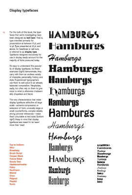
Fig 3.4 Display Typefaces


Comments
Post a Comment